
Posted by Karen Hesse
February 7th, 2015
Despite the fact that they’re nearly 400 years old infographics still have a place in the content marketing plans of many Irish companies. These smart graphical interpretations of complex data were first used in 1626 in a book about the sun’s rotation by Christop Scheiner (thanks to the good folks at Wikipedia for that one).
Since then, literally millions of infographics have been created on a range of topics from strange traffic laws to digital marketing strategies and facts about horrible bosses.
256 Media just added nine more infographics to the melting pot in a bespoke booklet commissioned by a new client. The infographics were designed to work together seamlessly in print but also to be useful individually on the client’s website.
While technology now does much of the heavy lifting for infographics it's often easy to tell the ones designed by professionals and those put together with proprietary software. If you follow a clear process for creating infographics it should help deliver a more professional result. Read on for five key things to bear in mind in your next infographic project.
1. Pinpoint the audience for your infographic
Before you start working on your infographic identify your target audience and agree your specific goal for creating it. You may be using the infographic as an information source for customers or potential customers. You may want influential bloggers to share it. You may want to generate engagement on your social media channels. If you set out your plan for amplifying the infographic at the start of the process, it can inform your design approach. For example, if you plan to print the infographic you will want to avoid using free infographic software that may not create files to a sufficient resolution.
2. Carefully gather your infographic data
The best infographics interpret data in an interesting and often quirky way. But they are nothing without solid background research. Carefully gather the data for your research topic in a spreadsheet, including the links to online material as you may need to check it later. You could easily pull together data from 20 or more credible sources for your infographic before deciding which pieces of information will work best.
Once you’ve gathered the data for your infographic, sift through to select the top 10 to 12 pieces of information that are most relevant and interesting to your topic. Always make sure to double-check your data before you start and ask a colleague to proof it too. Changing the data after the elements have been designed can considerably add to the production time.
It also goes without saying that you should always attribute the sources of your information at the footer of the infographic to give credit where it's due. Ideally, you would make it clear which source goes with which data point rather than just list all the sources.
3. Decide on a theme for your infographic
It's a good idea, where possible, to select a theme for your infographic, and if you're lucky the theme may be immediately obvious. But if it’s not, a good starting point for nailing a theme is a compelling headline. For example, an infographic for content marketing could use a fairground theme to show ‘why content marketing is the best show in town’. (We’re actually working on that one at the mo!).
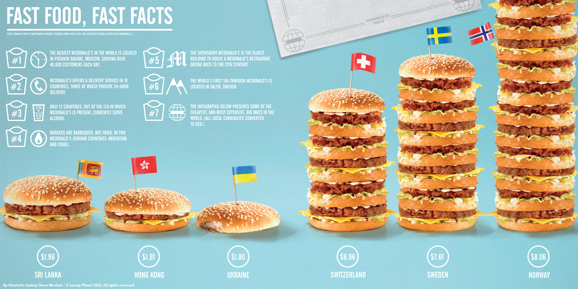
An infographic for a restaurant or food brand could display the information on a plate or a table or using relevant imagery like this infographic about fast food.
4. Create a story board for your infographic
Before you crack open Illustrator, Indesign or whatever programme you are using to design your infographic, you should plan where each element of the infographic will go. Sketch it out in pencil on paper if necessary. The researcher should sit down with the designer and agree which information will be given priority. For example, is there a running order for the data? Should one piece of data be more prominent than the other? Are there colours or particular kinds of graphic icons that need to be avoided? Agreeing the rules at the start will save you a huge amount of time as revisions after the fact will be time consuming and costly.
If a content marketing agency is working on your infographic, they will typically design up a colour palette and a sample of the design approach for you to sign off. If you’re designing the infographic in-house, complete the story board and palette for sign off by the stakeholders to cut down on the number of revisions.
5. Things to avoid in your infographic
- Avoid starting the design before you have all your data gathered and signed off by the various stakeholders.
- Avoid skipping the colour palette and story board stage. It will save you time in the long run and make sure all the stakeholders are happy with the direction.
- Avoid fussy orientations which make the data difficult to read like this soup infographic where you practically have to spin on your head to read it. (Sorry Fiesta Farms, the topic is interesting though!).
- Avoid squashing in so much information that it makes the design overcomplicated or the infographic too long. This infographic on 40 tourist scams to avoid this summer has great information but with over 14 panels of content it may be over doing it.
- Avoid using too many conflicting colours or icons. But remember the infographic needs to be visually interesting (unlike this Spring Break infographic which relies completely on brown and yellow). The really useful information in this infographic is lost in a poor execution.
Thinking of creating an infographic?
At 256 Media we’re crazy about infographics. We would consider ourselves one of the leading producers of infographics in Ireland - heck, we’ve even won a global content marketing award for their creation. If you're thinking of putting together infographics in-house we recently shared a handy tool for creating your own simple infographics in our Friday Freebie. But if you’re planning a more complex infographic project and you need expert help, get in touch.

Previous Post
How to create an infographic for free using Piktochart

Next Post

The Marketing Institute and 256 Media conduct Ireland’s first content marketing survey
You may also like...

Nadia Reckmann | Aug 16, 2024

Nadia Reckmann | May 30, 2024

Nadia Reckmann | Nov 23, 2023